Material Refresh for Cleartrip App
Designing for Android is one of the most challenging and underrated experience a designer can have. With the fragmentation so huge, the experience the designer intends may not reach the same on all devices. With Android Lollipop release, Google finally tackled its huge design problem with the Material design.
Material design for Cleartrip taught me some do’s and don’t while designing. I will share what I learnt over the course of our design process and how we redesigned our app and saw a significant increase in user engagement.
This article will talk more about how material design is seen by Cleartrip and how we applied to our brand and helped our customers. At last, I will share interesting insights on post material design conversions and how we took material design further with out Android App.
Intro
Cleartrip is a travel product focusing on giving millions of users a simple travel and local experience. The mission: Make travel Simple. The products ranging from Flights, Hotels, to Hyperlocal Activities, Food experiences, Local Events and more!
Who I worked with?
I worked closely with Jaydeep, Product Designer, Suman, The Product Manager, Sunit & Kedar, The Design Managers and kickass Android Engineers at Cleartrip. It's a project that wouldn't be possible without the contribution from various designers at Cleartrip.
Platfrom
Android.
How Long did it take?
Since it was a major refresh, the project almost took one year to be released to everyone. It was also not an active project for design team as we were solving our business & user problems and visited this refresh in parallel. Engineering side, this refresh involved lot of refactoring and building newer components
Design Process
Stage one: User Flow and Wireframe
The Material design might look like an aesthetic refresh, but deep down it encourages to reduce the clutter in the flow and delight the user with simplified content. We revisited our flow and understood some of the areas where we can improve with the new design and we took them into consideration during the user journey
Stage two: Design
Once the flow was ready, we decided to slowly migrate pages to newer design. But the complexity of it just begin, because we were simultaneously working on product features and I was always confused between which design system to use - The Material design or the old robust design system in use. This interim period was a bit challenging, but we managed to get both things done by smart prioritising and a tiny bit of double work.
Design Details
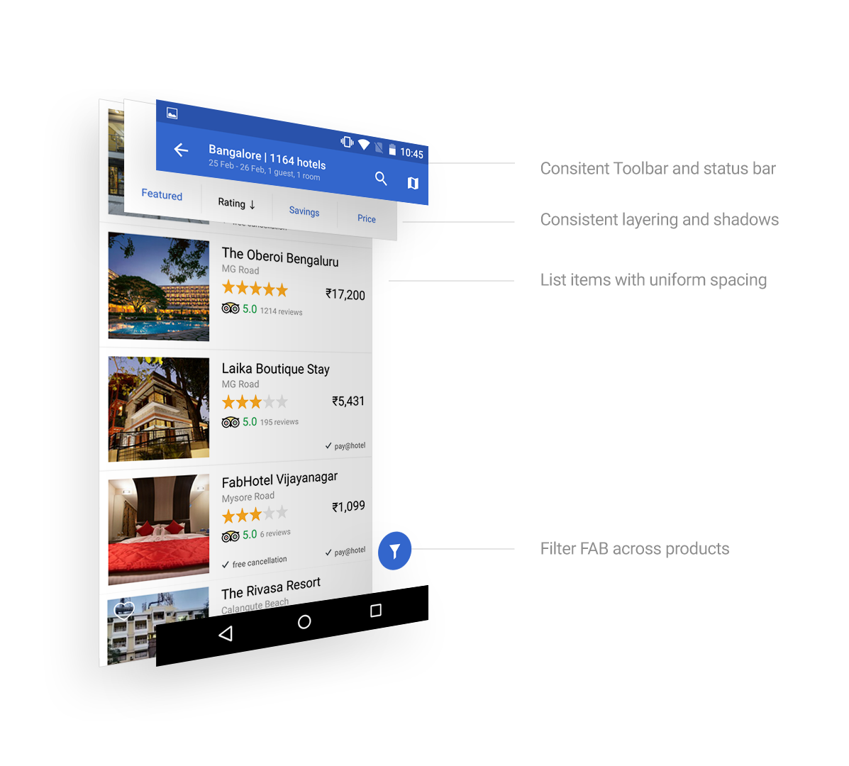
Navigation: The new tool bar is consistent across all the pages and should be flexible with action items on the right.
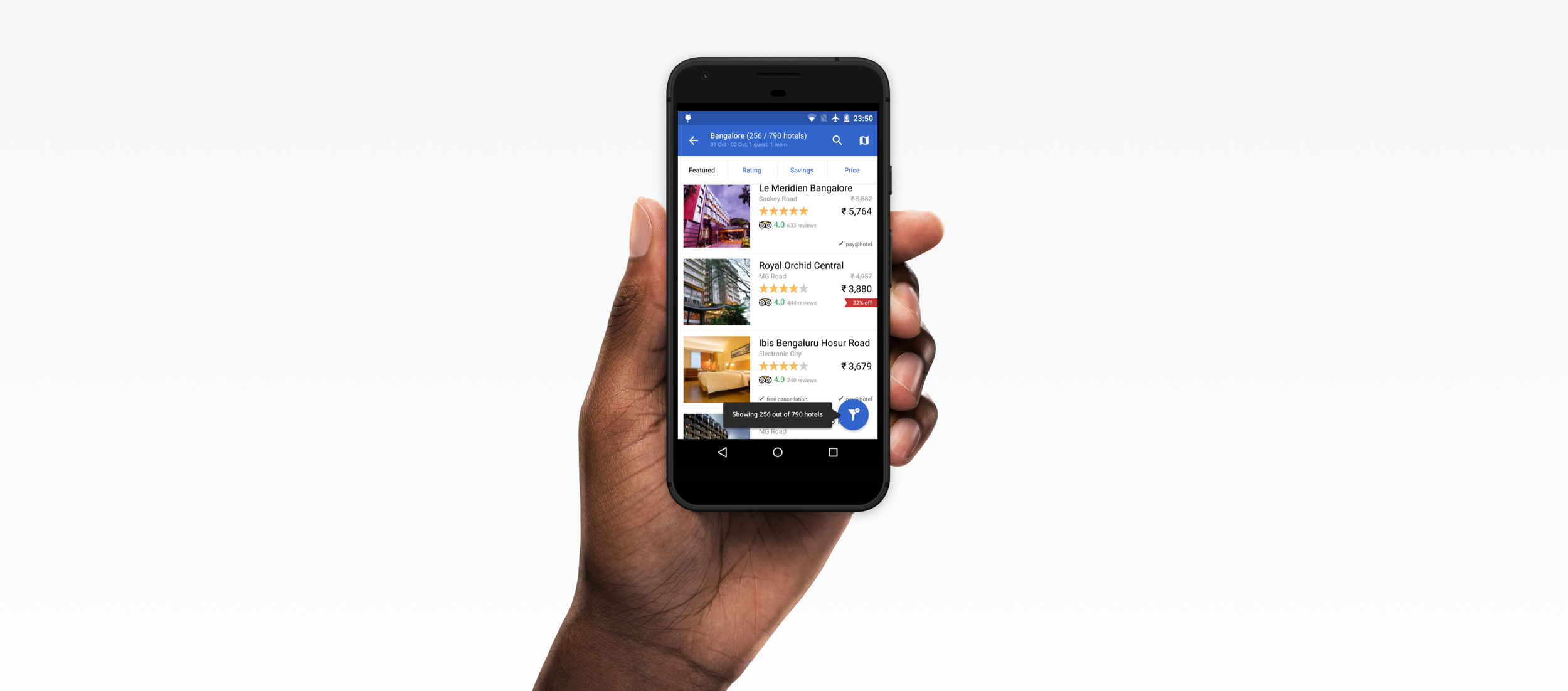
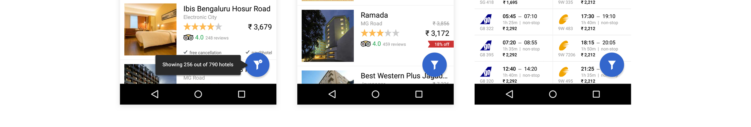
Floating Bars: We know that more than the tool bar, we might need a second layer which floats on the top of the content and gives access to the important actions users might be taking on the page, like our sort by Feature, Price, Ratings
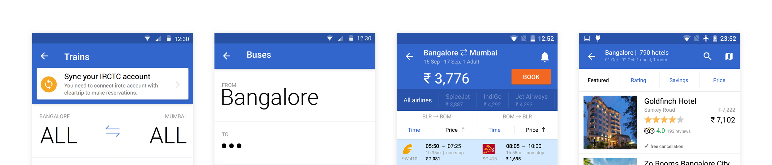
Content is the king: We cleaned up our super simple content cells for our listings and applied few more spacing guided by Material Design and we felt that the content has more breathing space
Floating Action Button: We knew that this is one of the buttons google tested well with their users and we immediately felt that we could bring in some important action for the page here. We decided to move our filters action here and give access to contextual filters for different products
Icons: Cleartrip always had a strong design of filled icons in the non-material app. What we did is to scale those icons and polished them to fit into the new material design icon family.
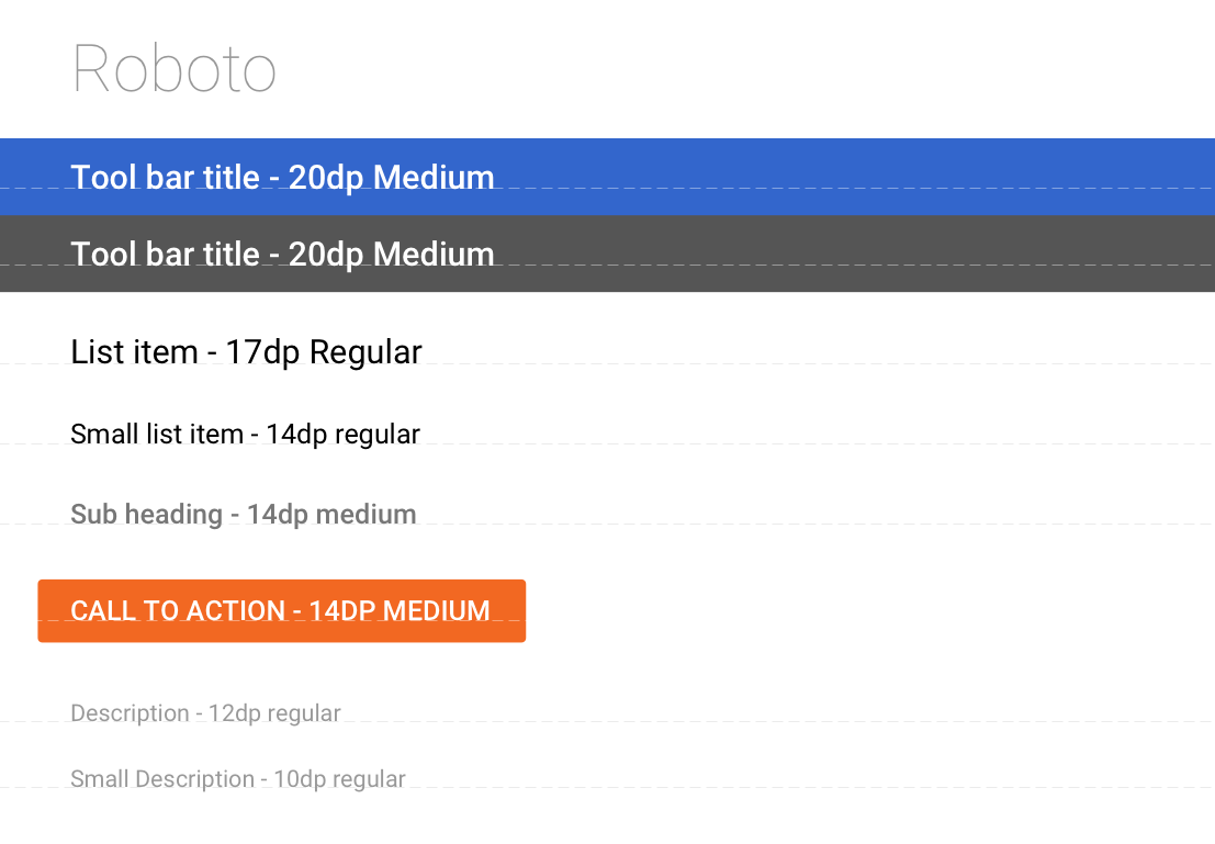
Typography: We were using Roboto in pre material version of the app, so it's easy for us to adapt the Material typography. We went through all the font sizes and weights and standardised them through out the Platform through this process
Forms: One of the best things about Material design is that all the new input form units that are readily available as a code. We decided to adapt these form and scale it to our book flows and Signup / Login forms

Temporary Modals: Since the flow required users to enter different forms of fields to search for flights/hotels, we used a dark theme to represent a temporal state.

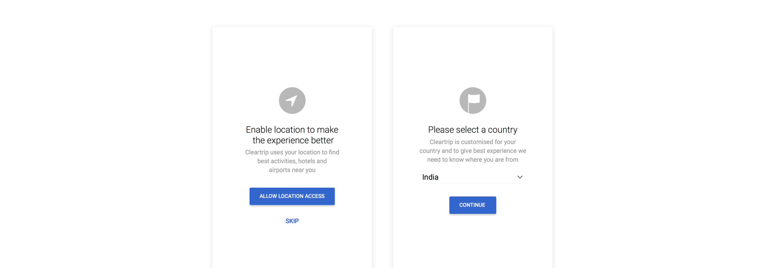
Zero States: We also added some permission screens after the material design launch to address the new Android Security and permission flow.
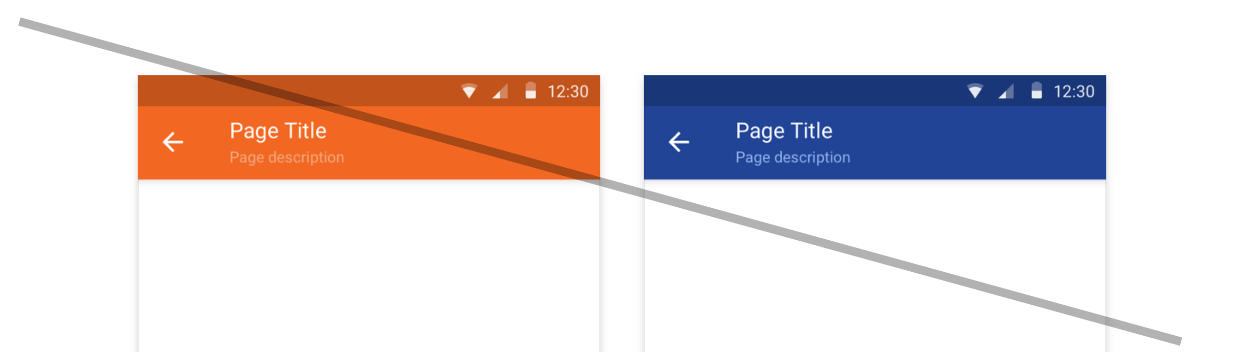
Colors: Material design uses 15% of screen space to show toolbar on an average screen. This toolbar utilises the primary colour. So we felt the primary colour we choose might decide how uses perceive our app. From our app icon, its easy to arrive to orange as primary colour, but we felt its too strong for our users.
And especially with Android’s battery warning, our app might create a sense of urgency which we don’t intend.
We decided to use the blue from our logo and use orange as our accent colour. But the problem with our blue is that it won’t suit well for high contrast material design colours. We had to pick a colour that's already been used in our apps on other platforms. #3366cc is a colour that we popularly used in our iOS app, so we decided to bring it to Android.
We decided to use our orange as a partial ascent colour. We see the orange, brand colour as sprinkles on the cake, and having it all over the app kinda felt overwhelming. So we continued to use blue as the action colour as our primary accent colour. The booking buttons and actions that lead to transactions remained orange.
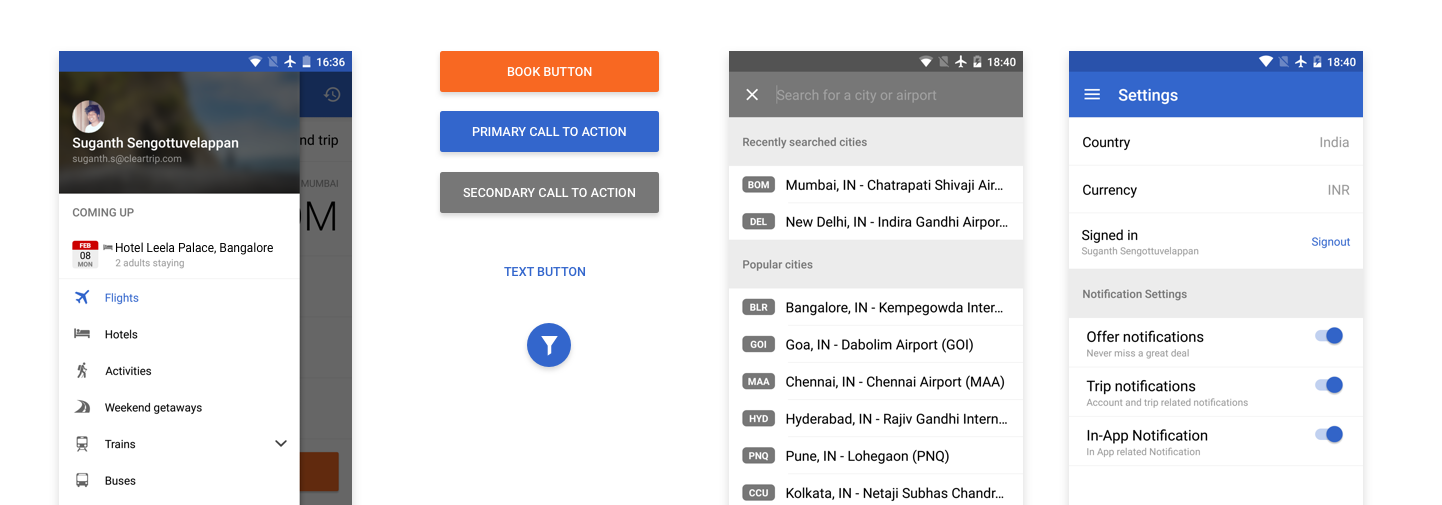
Icon and Branding: Before we decided to go full Material design, we also tweaked the icon to be more flat and material. Android Lollypop also brought minimalistic white icons in the status bar. This made us go monochrome on our notification icon.

Stage three- Launch & Iterate
When we launched, we immediately felt our users are starting to like the app. It was gradual roll-out and we released to everyone in next few days. We did get good feedback over the next few weeks, but most of them were less critical, and we fixed those bugs in consecutive releases
Insights on Material design Launch
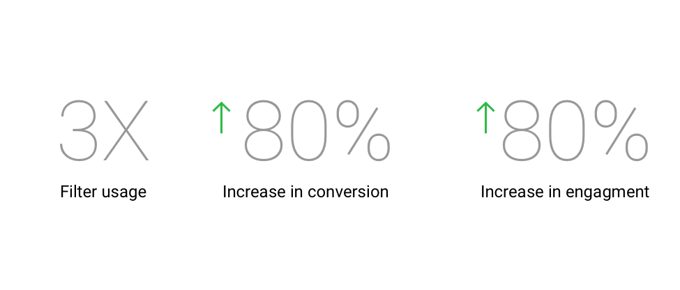
With material redesign, We saw a good impact in our conversions. We saw increased usage of our filters in hotels and flights. Lesser drop offs in few main flows.
Google has well thought and built an amazing design framework which everyone can adapt and use. With very good development support, they offer a lot of SDK’s and components which made the material design truly feasible for Cleartrip.
Learnings
- The scale of the Project: Initially I expected it to be a small project, but this isn't easy or small project. It helped me to plan many things in parallel and made me think bigger, beyond those 8X8 Grid and XXHDPI screens
- Being Open Minded: Since Android is a system that's segmented a lot, designs look a lot different across different devices, starting from colours and fonts. Sometimes the components don't behave or even look the same way as designers intended to and it's the nature of the eco-system. I learnt how to embrace that feedback and made me more open-minded
- Be okay in getting help: Since it's a brand new design language, I had to often seek help in understanding components and how it would work. Even google didn't fully apply material design to all their apps, so I had to constantly seek inspiration from the wide community